.png)
The 2-Minute Etsy Product Image Split Test That Changed Everything
- Nov 14, 2025
- 2 min read

Sometimes the biggest wins come from the smallest tweaks.
Over the last couple of months I ran a split test on one of my best-selling products on Etsy. This 2-Minute Etsy Product Image Split Test That Changed Everything. The listings were identical - same title, tags, description, everything - except for one tiny change.
One version had a light, creamy background behind a little piece of brown paper in the center.
The other? The exact same image, but with that creamy color flipped to black.
That’s it. Here they are 👇

And yet - the dark version massively outperformed the light one. You can see the difference in sales volume?
It was such a good reminder that even the tiniest design decisions can completely change how your product stops someone mid-scroll. And what works for one audience might be the opposite for another.
If you’ve never tested your thumbnails before, here are a few simple things you could run a split test on next:
🖼️ Background color or texture – Light vs dark, linen vs paper, color vs neutral.
✏️ Font weight – Try bold vs thin type or switching to a clean
sans serif.
🎨 Accent color – Change one key color (like pink to gold) and see which grabs more clicks.
📦 Mockup style – Flat lay vs 3D product display.
🌿 Props or no props – Adding subtle scene elements vs a
minimal layout.
📋 Label placement – Move your title strip or “editable template” tag to a new corner.
💡 Contrast levels – A little more brightness or shadow can dramatically shift perception.
🔍 Zoom or crop – Closer in vs more space around your product.
Each of these tweaks takes minutes - but the data you’ll get from testing them is priceless.
Remember: Only change one thing so you can actually see what is
making the difference!
If you learn what your customer’s eyes are naturally drawn to, you can start designing with that insight baked in.
Small tweak, big payoff.
love, Jessa
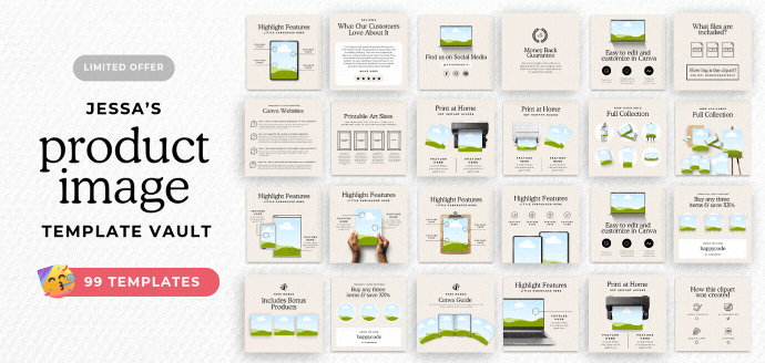
Ps: Need some help with your product images?
You will love our massive pack of templates here👇


Comments